Since I discovered a love for watercolours this year – a medium I used to hate with a passion – I decided I should start branching out and trying more mediums I didn’t like. So I dug out an old box of chalk pastels (and some charcoal) and decided to give it a go!
This was my first time trying chalk pastels in at least 8 years. I hardly ever used pastels before and I don’t remember anything about how to properly use them so this had quite the learning curve.
Where it Started
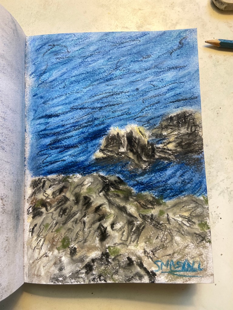
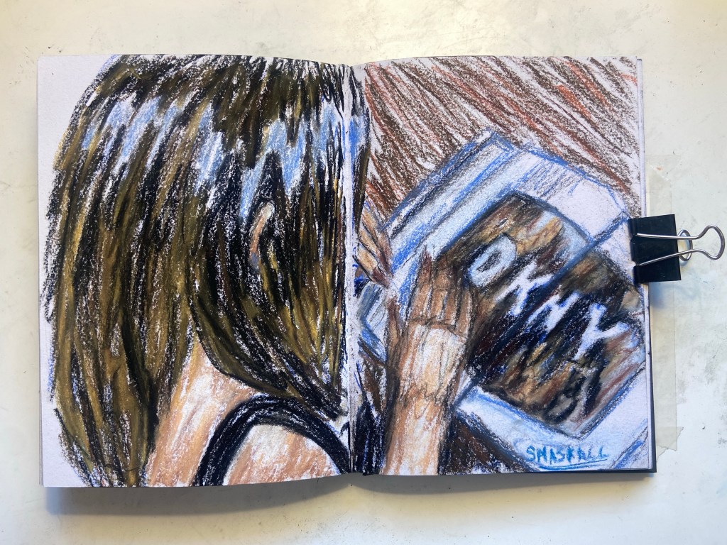
This was my very first attempt and you can probably tell that I struggled a lot with blending and texture. When I paint with watercolour or acrylic I’m never using the colour out of the tube so I was struggling between layering on a ton of pastels and blending them but loosing a lot of shape and texture or sticking to one colour and having it look flat.
Second Attempt at Pastels
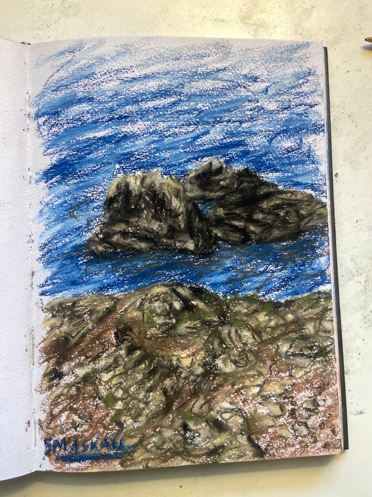
This was an image that I had previously painted in gouache right when I started painting again last year so I already knew the shapes and colours that could help bring it to life. This time around I tried for a more minimalist less blended approach. Lots of white spaces are left, there is very little shading, and it’s easy to see the strokes of the pastel. I was much happier with this attempt.
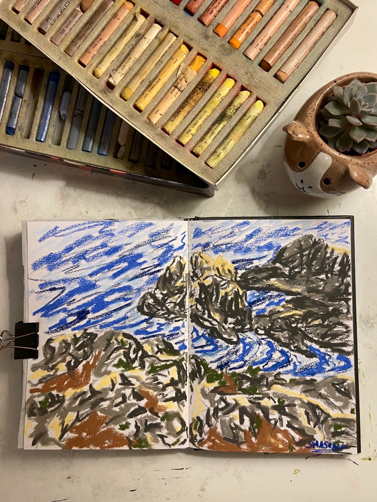
Whidbey Island Shoreline, Again
So I decided to revisit my first attempt and try it again with some of the techniques I learned. I still wasn’t entirely satisfied with this attempt so I might give it another try again soon, but there’s clearly some improvement.
Hard Pastels

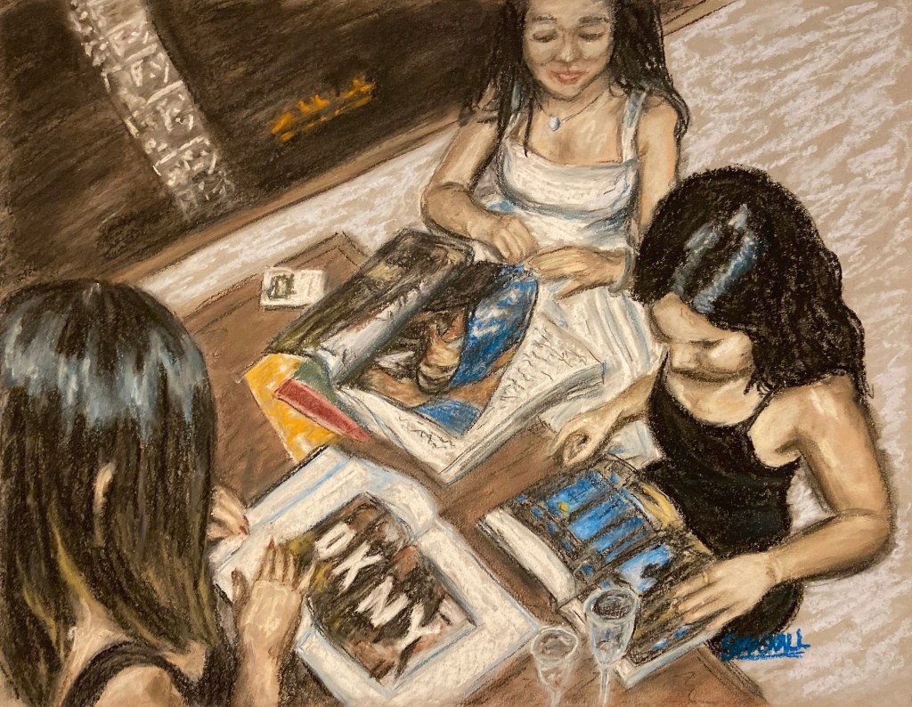
I had a smaller box of hard chalk pastels so I decided to test those out, drawing from a film photo I took a few years back of a row boat. This set of pastels only has about 7 sticks to choose from so the colours I had were quite limited. I do think the effect of these pastels looked very cool. It was easier to get thinner, more defined lines, even when blending a few colours. And the image I based this off of was already quite monochromatic so the limited pallet worked well.
The Big Piece
Since I had an empty frame sitting around and the only paper that was the right size was for dry mediums I decided to start a bigger piece to fit it.
I tested out some colours and techniques in my sketchbook first using a corner of the image and then put it on paper. There are some things I can definitely still work on with pastel but overall I like how this came together.
Part of me deciding I was done was a little bit of me being fed up with chalk pastels so I dust getting everywhere. But for what was probably my first large scale pastel drawing, I’d say it’s a solid first attempt.
Just When I Thought I Was Over Pastels…
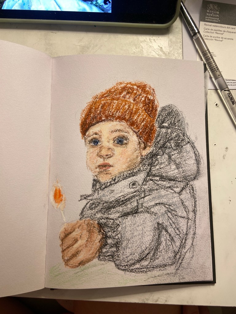
A quick portrait attempt from my sketchbook. I don’t like the amount of grain this paper has for doing portraits like this, since I was trying to a more blended, soft look. But, for a quick sketch for someone who is still working on drawing faces after an 8 year break, it wasn’t the worst.
I packed up and put away my pastels only to get them out again last night. I’ve been seeing a very specific style of pastel and mixed media on Pinterest that I wanted to try. Plus, I had got back some old film photos from a roll I shot over the past year on my old Suntone, so I was feeling extra inspired.
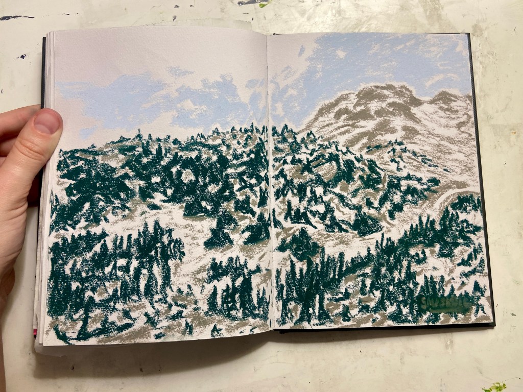
I tried a few in a similar style of these mountains in watercolour that I’ll post soon too, but I really love the texture of pastel for this scene. I might even turn it into a full scale piece since every time I’ve drawn these mountain scenes part of the mountains or the lake below gets cropped out and I want to draw it all in one piece. But that will be coming in the future!
One More Attempt at the Whidbey Island Shoreline
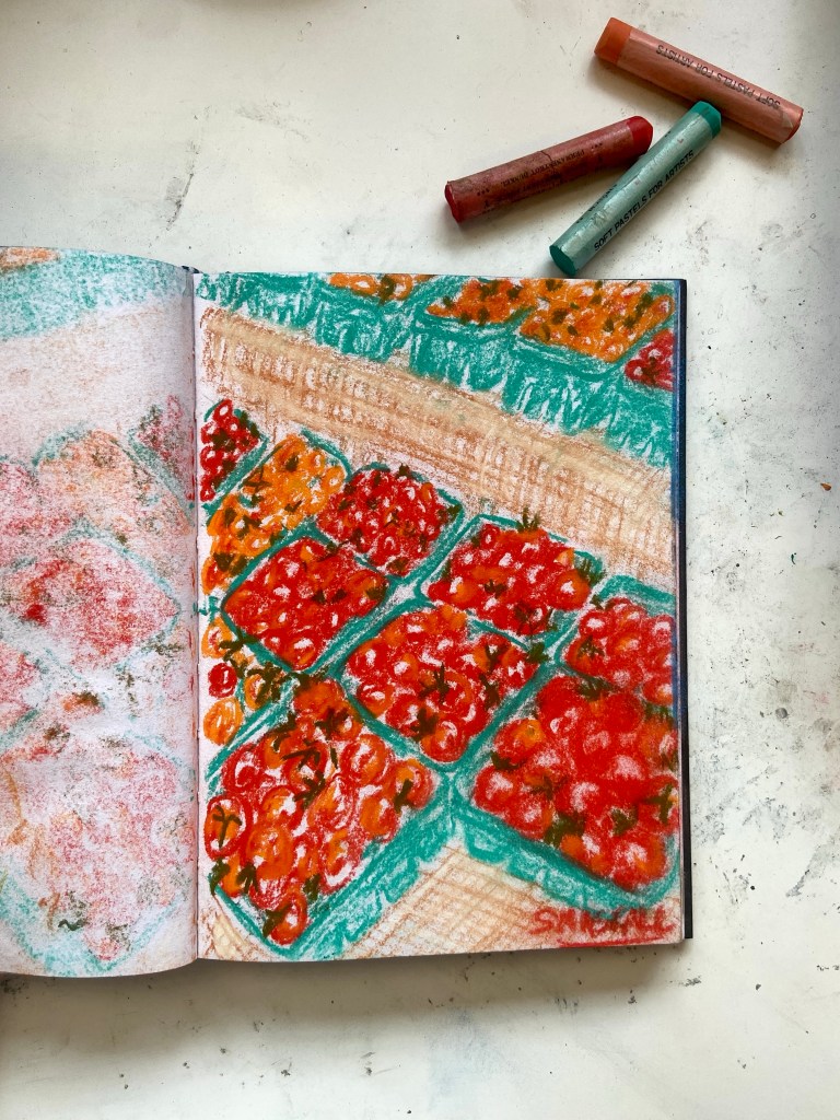
Writing this post inspired me to try this scene one more time. I wanted it to be loose, expressive, and bright, rather than focusing on the fine details and shading. I’ve been trying to go beyond the exact colours in the photographs and became looser with form so this was a fun little exercise to push myself outside the box a little more.

Leave a comment