I realized I haven’t posted a lot of my out of sketchbook work on the blog, so here’s a little overview of what I’ve been up to. All these are in gouache and watercolour.
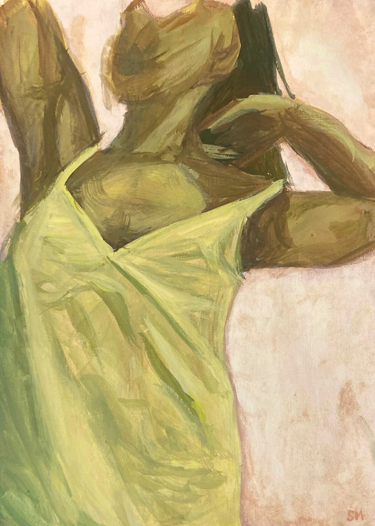
This first piece I actually started in 2020. For a day I thought I should get back to painting and I settled on a series of paintings that were partially self portraits. I took images on self timer and, going for a looser, modern style, I decided on focusing on a yellow-green tone, aiming not to use any colour that was the same in the original photo.
When I started painting again in the fall of 2024, I remembered this one and thought it could make a good addition to my wall collage of artwork. Only one problem: I thought I threw it out. Thankfully I actually did save this (and at least one more of the series but I need to fix up a few things on that one). I added the pink background – I think it was a pale yellow originally – which I think really brought this together. Moral of the story: never throw out your old artwork.
This one above was a painting I did in my sketchbook. Looking at it now it’s a bit basic and plain but I really enjoyed this one, using blue shadows and painting the moss, bird poop, and weathering wood and paint. These ideas will be continued later.
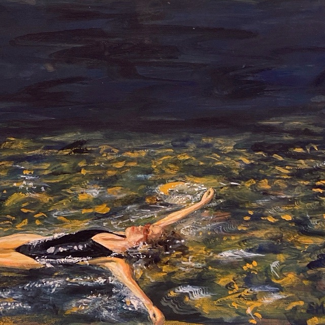
The Swimmer | Gouache on Acrylic Paper
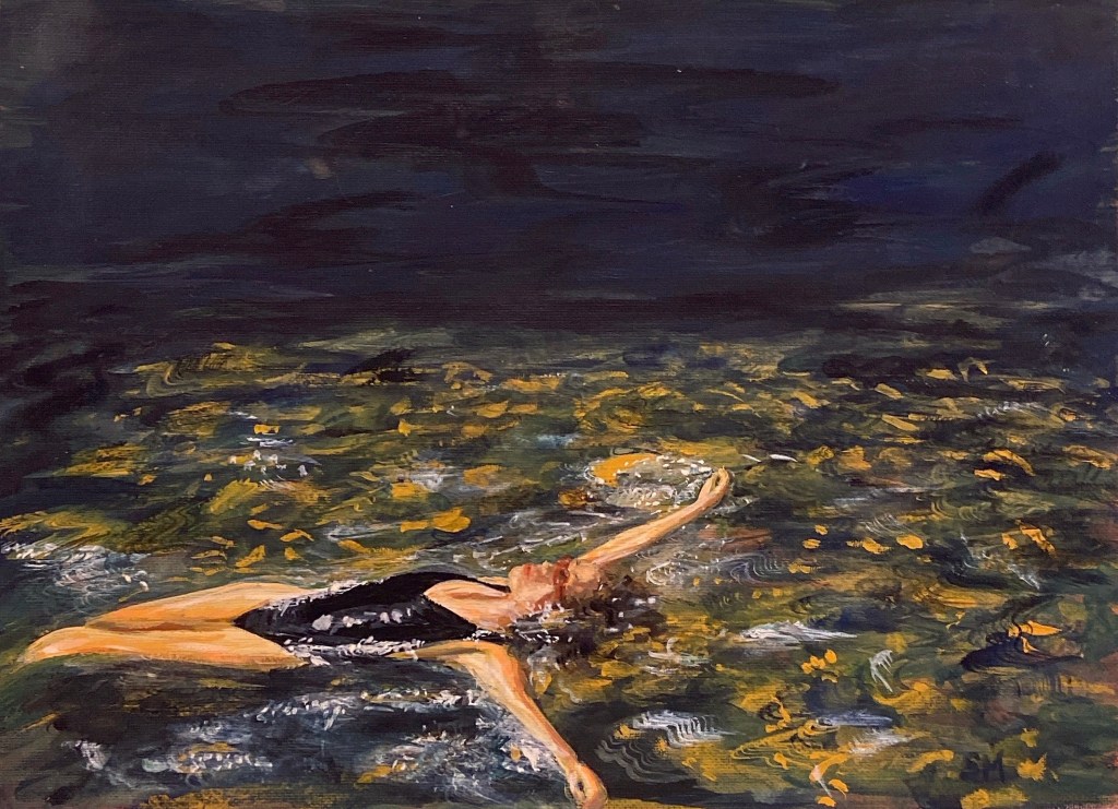
This piece was inspired by one of my film photos of my friend Zoe – who has a print of it the painting in her house now. Here’s the original for a little side by side.

I struggled a lot with the body and face and finding a way to represent the water but I had a lot of faith in experimentation which I think really paid off. The yellow ochre in the water really captures the feeling of hot summer weather, with loose brush strokes to suggested the movement of the water, courtesy of my favourite fan brush that I stole from my high school art room. I would like to paint this again, maybe in acrylic on a larger canvas. I think it deserves to be on a larger scale than small paper.
More Small Gouache Paintings
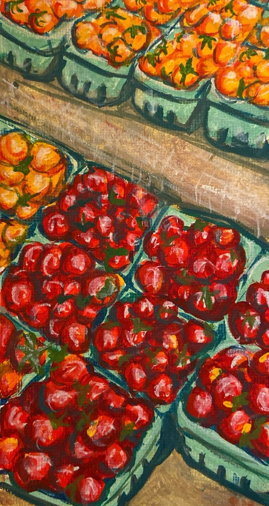
This first painting of the tomatoes is probably true to size on whatever screen you’re looking at it from (very very small). I had one remaining small scrap of acrylic paper so I used to for this small tomato painting. For this piece, I wanted to focus the bright colours and contrast between them.
Since I’ve started painting again I’ve been working on developing my personal style. I used to be focused on a very realistic, precise approach to everything I painted. I would stress over tiny little brushstrokes and the more minuscule of details, making sure everything is blended naturally. My obsession with everything being perfect I think is partially what stopped me from painting and drawing for 7 years.
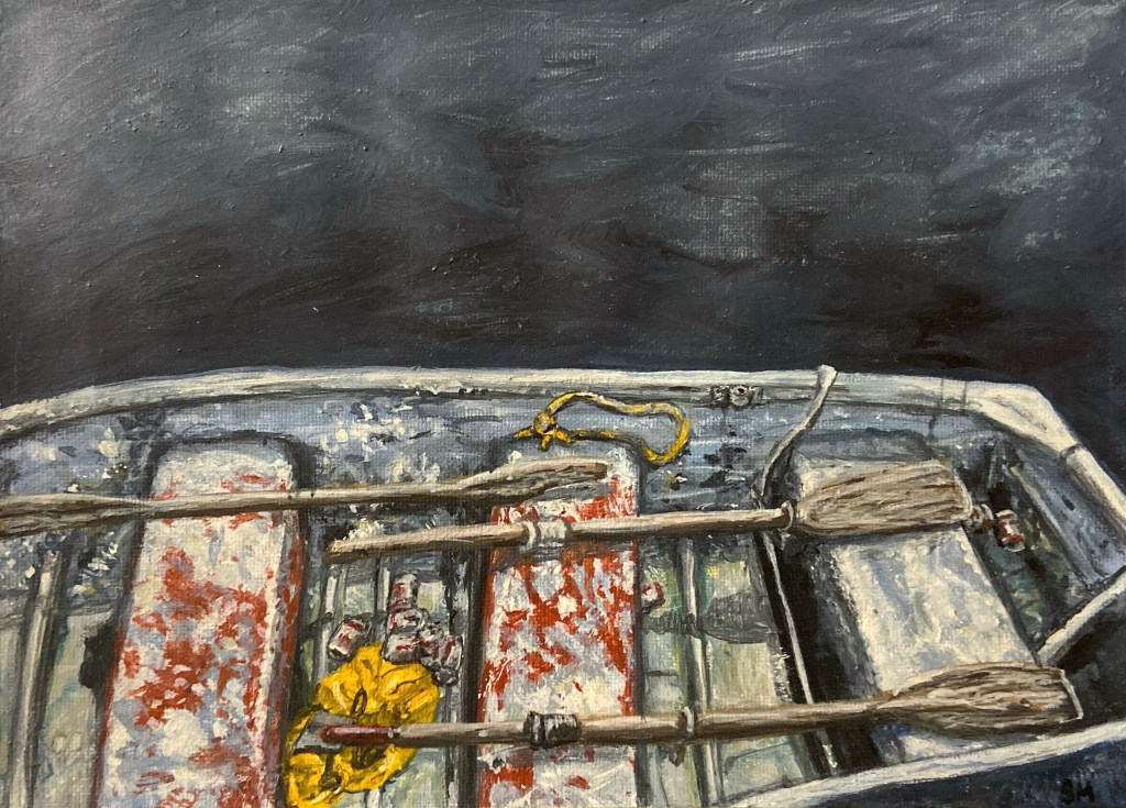
I’ve been trying to adopt more of a “Bob Ross” or Lynchian mindset, acting more on instinct and embracing the “happy accidents” that result from this. I’m still trying to find my exact artistic voice but I think there’s been a big change compared to the artwork I was creating in high school. The painting above, for example, I was more focused on the dingy, dirtiness and the texture of the piece, using more visible brush strokes to suggest aging, peeling, and grain. I did have some issues in the water with the paint coming off when I tried to layer on more – I think I unfortunately was using some cheaper paints. But I’ve restocked my Holbein paints since then so I shouldn’t have that problem again.
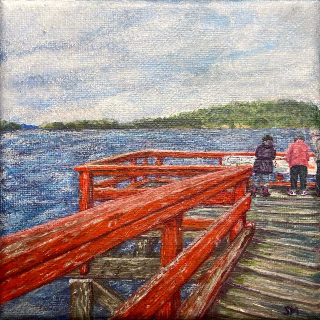
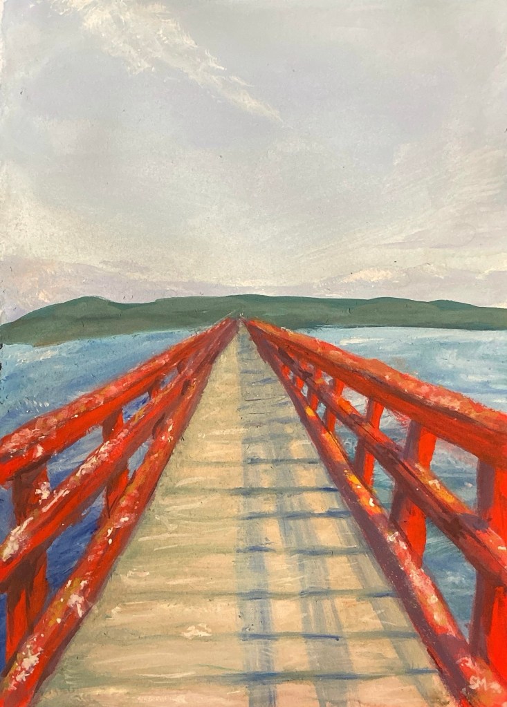
This was a tiny square canvas I had – I have a second one to paint still. I really love painting wood grain, mossiness, and peeling paint. This wasn’t my first painting of this dock and I’m sure it won’t be my last. I think I could’ve done more with the background in this. I didn’t go in with any big idea except to copy the photograph I took and add purple into the shadows (expect to see a lot more purple in upcoming pieces). I think I could have darkened or faded out the background more. I do really love the dock itself though.
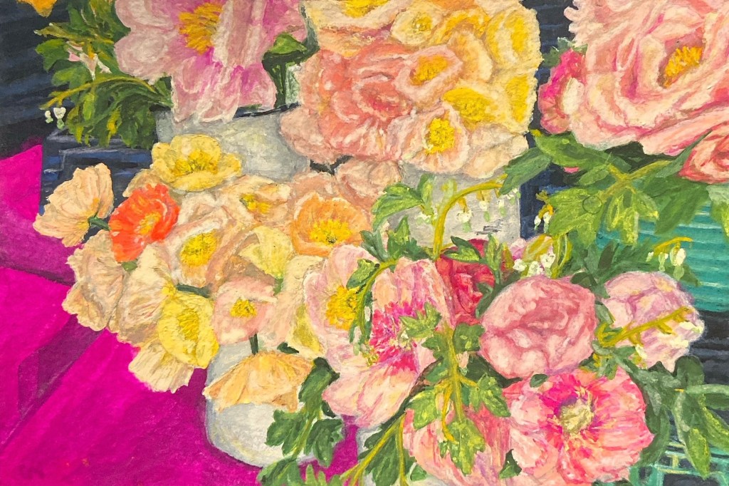
This next painting is gouache on watercolour paper. I think the amount of grain was too textured for the fine details. I did have a lapse in my “let’s not overwork and obsess over fine details” mindset for this one. And in the end I didn’t really like it that much. When I first blocked out the colours I weirdly liked it the best – the contrast between the teal on the right and the magenta on the left. Maybe it’s time to redo this with a looser technique.
Part 2 of my recent artwork will be up soon! Follow along to see me try some new mediums.

Leave a comment