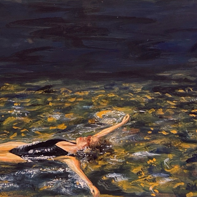
Recently I’ve been very getting comfortable with painting landscapes in watercolour and pastel so I wanted to set myself a challenge by doing portraiture.
Years ago, back in high school, gouache portraiture was one of my strengths. I don’t know if it was a conscious decision to differentiate my art now from high school or if it’s just because the subjects I’m interested in have shifted, but I’ve really only done one since starting art again. A lot of my recent art has been very traditional and stylistically very safe.
Stylistic Choices
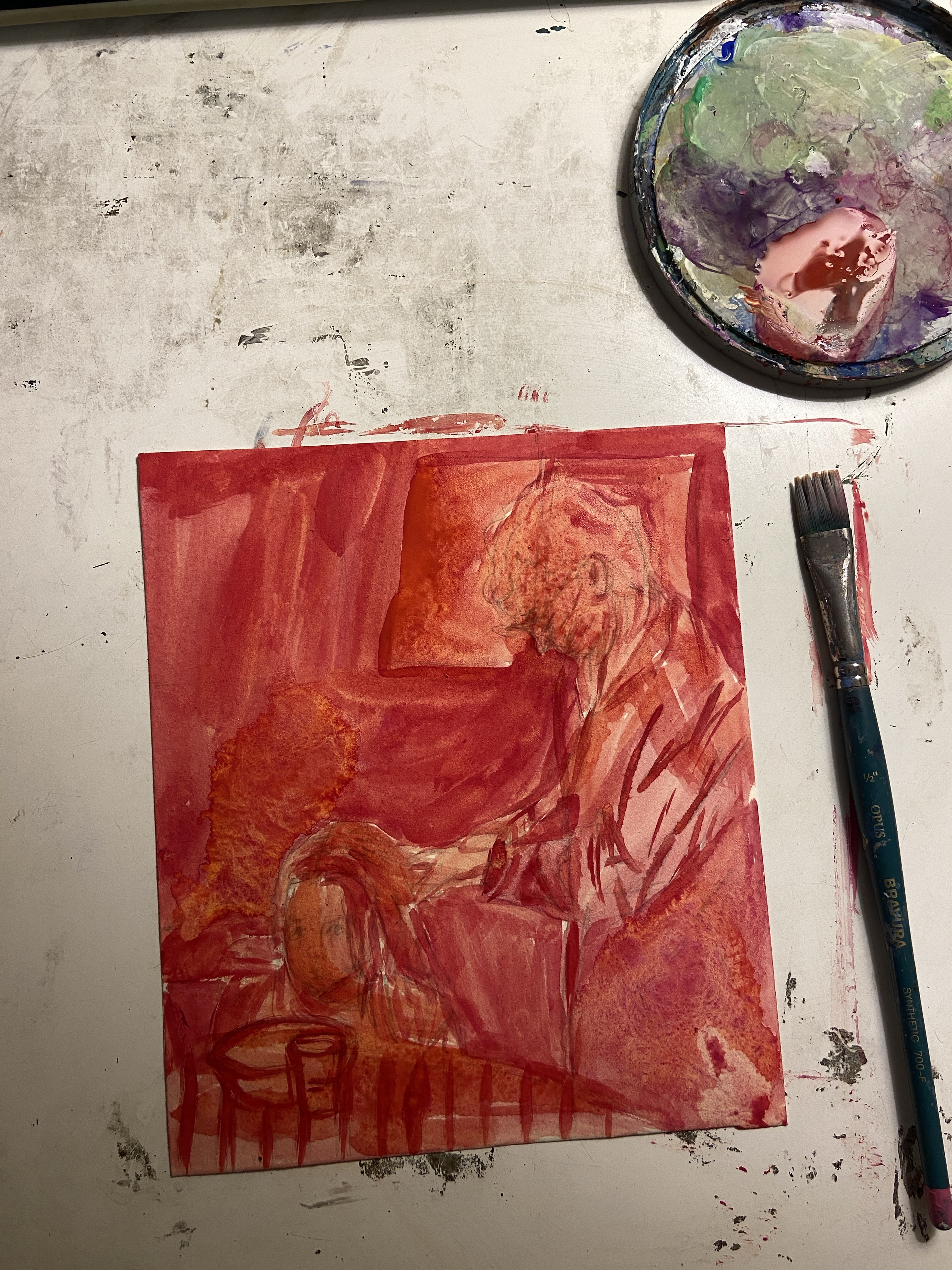
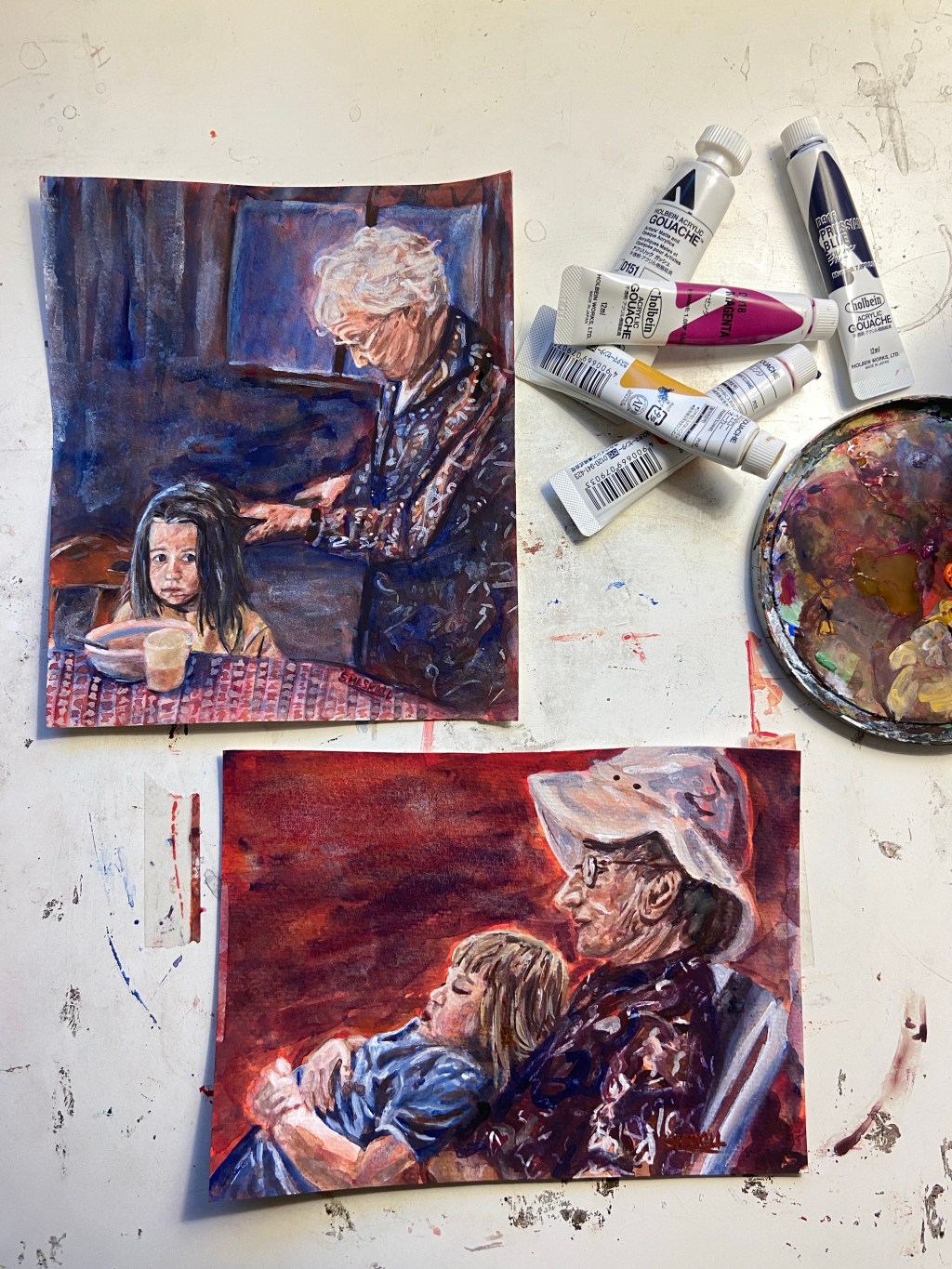
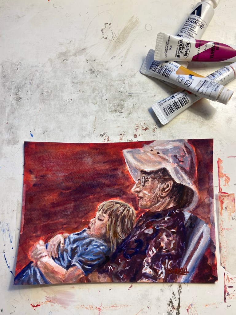
One of my main motivations behind my stylistic choices for this series was to modernize my work. There’s been a big trend of using hot pink for under painting and letting it poke through – so that’s where I started. I also decided to limit my paint to 5 colours: Orange, Yellow Ochre, Prussian Blue, Magenta, and White. I tend to fall back on copying a photo rather than making my own stylistic choices, so this way I had no choice but to be different.
Painting #1
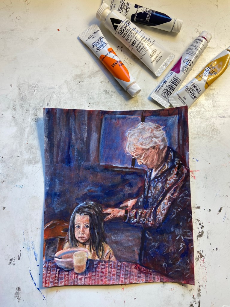
Since I wanted to keep the pink (a mix of orange and magenta) visible, I wanted to keep everything very loose and not stress over fine details. My biggest struggle for this piece were the faces and mixing skin tones in a way that didn’t make them too grey. Working in very thin layers really helped bring more dimension out without too much overworking. My favourite parts are the warm orange tones in the chair, the cloudy plastic cup and peach bowl, the red print of the table cloth contrasting to its blue shadows, and both figures – especially my granny’s hair.
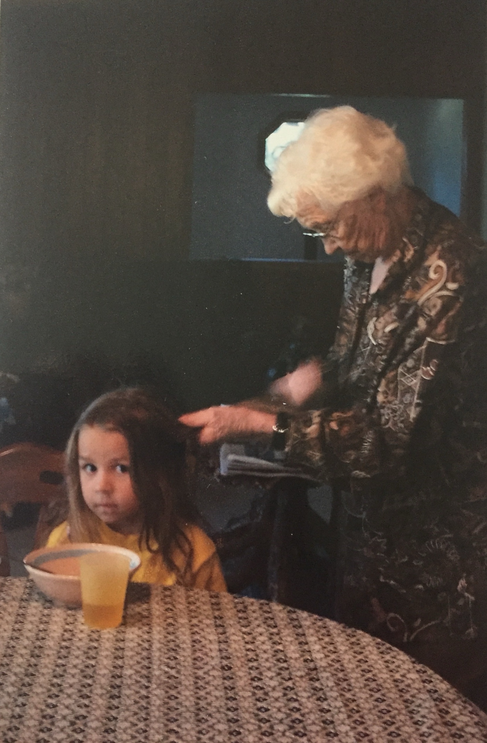
My reference photo was an old childhood photo of me and my great granny at breakfast. I was in a phase at this point where I refused to brush my hair or let anyone else brush it. My one exception was my granny because her mom used to do the hair for the “princess” (what they called nobility) in their village in what was then Poland and now is Ukraine so I couldn’t say no to the princess treatment. But I still didn’t look very happy about it.
Painting #2
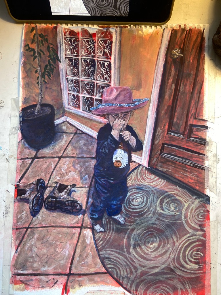
I wanted to paint a photo that looked a little happier. I think I was around 3 years old in this photo. And yes, my granny is in the same coat as the last photo. This one I did a lot quicker and didn’t obsess with getting everything perfect. Even though there’s things where proportionally that’s not perfect, I don’t want to lose the painterly, watercolour-y style of it. Again here I love what the under painting does for the skin tone.
Painting #3
In progress right now is a third painting that’s in this general series/style. The subject has changed to a picture of my nephew so it’s almost series adjacent. A fun coincidence about this photo though is the tree in the back was my great granny’s so she’s still infused into this photo in spirit. I’ve had a lot of fun in this style so I’m sure there will be more coming later on too.

Leave a comment